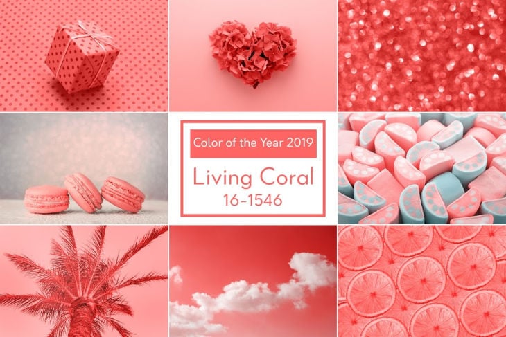
Living Coral is the name of the PANTONE trend colour 2019. Why and how the shining coral now makes marketers' products and design strategies shine - and which flavours it brings to beverages in 2019!
When looking at the flavour trends of the new year, in addition to taste the optical kick is crucial. The new trend colour Living Coral indicates the (colour) tone this year. Living Coral is "a vibrant and life-affirming coral shade with a golden undertone that makes it softer and more vibrant" - this is how the ink manufacturer Pantone describes the trend colour PANTONE 16-1546 Living Coral, which will accompany us in 2019.
From rhubarb to pink grapefruit to guava
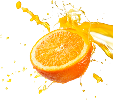
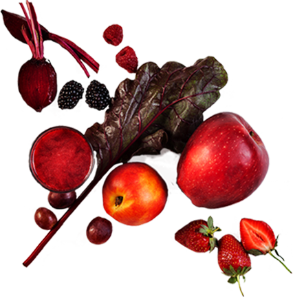
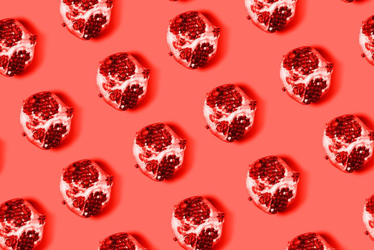
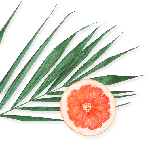
Austria Juice uses this trend colour as inspiration for its flavour creations. This year, the spectrum of floral flavours ranges from floral nuances to exotic fruity notes that are ideal for food and beverage products. This year, Austria Juice uses coral as an inspiration for the flavours - rhubarb, pink grapefruit, pink guava, blood orange, watermelon and organic hibiscus extract.
What makes the new trendy colour so attractive - also for food and beverages? Living coral was inspired by web and social media: digital technologies and social media are increasingly embedded in our everyday lives. On the Internet we are looking for authentic experiences that allow excitement, connection and intimacy. Living Coral reflects this development as colour.
Spirited and sociable
"The appealing nature of Pantone Living Coral is sociable and spirited and invites to carefree activities," commented the colour experts, in this context. Pantone Living Coral embodies "the innate need for optimism, joyful pursuit and our desire for playful expression."
Living Coral represents the fusion of modern life with the digital world and is a colour that appears in our natural environment while being present in social media.
Pantones Colour of the Year: Setting the tone for 20 years
What makes the trend colour of the year so significant? Pantone's Colour of the Year has influenced product development and purchasing decisions across all industries for over two decades. From fashion, beauty, stock photography and interior to industrial design or product-, packaging- and graphic design, the Pantone Colour of the Year literally sets the tone in all optical worlds for one year. Today we look back on a diversified range of colours: While in 2018 the colour Ultra Violet accompanied us, in 2017 it was the gentle Greenery. In 2016, Rose Quartz and Serenity even produced two colours simultaneously. In 2015, the whole world opted for the colour Marsala and 2014 on Radiant Orchid.
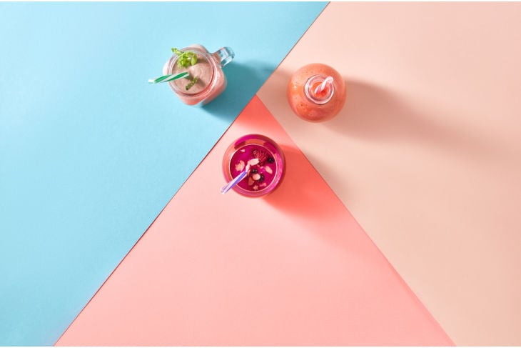
Example: Thomas Henry presents drinks in Living Coral
Choosing the colour of the year is preceded by a careful analysis, where Pantone Colour Institute's colour experts - a Pantone consultancy that helps brands and designers develop the right colour strategy - research the new colour influences around the world to make their selection.
Colour analysis across all industries
In this process, among other things, trends from the entertainment industry, art collections and all areas of design are scoured and analyzed. The colour experts target popular destinations and new lifestyles as much as games, important social media platforms, international sporting events or socio-economic conditions. New technologies, materials, textures and effects also determine which colour will eventually be the trend colour of the year.
The powerful worldwide influence of the Pantone Colour Institute highlights the extent to which the choice of trend scouts determines the future colour scheme of designers and marketers around the world.
When the new Colour of the Year is appointed, Pantone offers large palettes of combinations with other colours. At this point, bloggers and influencers, who are eagerly awaiting the new trend colour each year, are coming into the game. In their blogs and videos, they give many tips on how to apply and combine the new trend colour throughout the year. Obvious, that current products in the appropriate colour must not be missing!
Important: If your products shine in Pantone Living Coral, do not forget to put the appropriate hashtag #COY2019 on your social media posts!
CONCLUSION:
Anyone working in product development and design cannot ignore the PANTONE Colour of the Year. In 2019 everything is coloured in Living Coral - a vibrant colour that represents liveliness, optimism and vitality. Practical tip: The top professionals of the Pantone Colour Institute will advise you on how to develop your individual colour strategy with Living Coral! For beverages, Austria Juice features “Living Coral” in flavourings like rhubarb, pink grapefruit, pink guava, blood orange, watermelon and organic hibiscus extract.
Those were the trend colours of the last years:
- PANTONE 18-3838 Ultra Violet (2018)
- PANTONE 15-0343 Greenery (2017)
- PANTONE 15-3919 Serenity and PANTONE 13-1520 Rose Quartz (2016)
- PANTONE 18-1438 Marsala (2015)
- PANTONE 18-3224 Radiant Orchid (2014)


Cornelia KerschbaumerAuthor
Director of Marketing & Communication
You may also like
Interested in more?